You have seen a competitor's website - or maybe a brand you genuinely admire - and thought "I want my site to look like THAT." Not their content. Not their logo. Just that clean, professional feel. The confident layout. The colors that somehow make everything look expensive. You want to copy that website design with AI and make it yours. Until recently, that meant hiring a designer for thousands of dollars and hoping they understood your vision. Now AI can do it in minutes.
This is not about stealing. This is about doing what every professional designer already does - using references, mood boards, and visual inspiration to create something original. The difference is that an AI website builder can analyze a reference site and apply its visual principles to your business in minutes, not weeks. You get the style you love with the content that is uniquely yours.
In this guide, you will learn exactly how to take AI website design inspiration from sites you admire - where to find the best references, how to tell the AI what you like, and how to combine multiple styles into something that feels custom-built for your brand.
Why Borrowing a Website Style Is Smart (Not Stealing)
Let's address the elephant in the room right away. There is nothing wrong with looking at a website you admire and saying "I want something like that." In fact, this is exactly how professional design works.
Every designer - from freelancers to the top agencies charging six figures - starts with references. They collect mood boards. They screenshot sites they like. They present "style directions" to clients that are explicitly based on existing work. This is not a secret. It is the standard, accepted process in every design studio on the planet.
When you tell a designer "I want something that feels like Apple's website," they do not copy Apple's website. They study what makes it feel the way it does - the generous whitespace, the clean sans-serif fonts, the restrained color palette, the way photography takes center stage - and they apply those principles to your business. The result looks nothing like Apple, but it carries the same sense of confidence and simplicity.
Here is what you are actually borrowing when you reference a website you like:
- Color palette - the combination of colors that creates a certain mood
- Typography choices - font pairings, sizes, and weight that set the tone
- Layout structure - how content is arranged on the page
- Spacing and rhythm - the breathing room between elements
- Overall vibe - minimal vs. bold, warm vs. cool, playful vs. serious
None of these things are copyrightable. You cannot copyright a color scheme. You cannot copyright the idea of putting a hero image at the top of a page. You cannot copyright "generous whitespace." These are design patterns - shared vocabulary that the entire industry uses.
What IS protected: someone's actual content (their text, their photos, their illustrations), their logo, their brand name, and their code. But you are not taking any of that. You are taking the visual direction and applying it to your own content. That is not just legal - it is smart business.
Think about it this way. When a new restaurant opens and models its interior design after a trendy spot in New York - same exposed brick aesthetic, same style of pendant lighting, same kind of menu layout - nobody calls that stealing. They call it good taste. The same principle applies to websites.
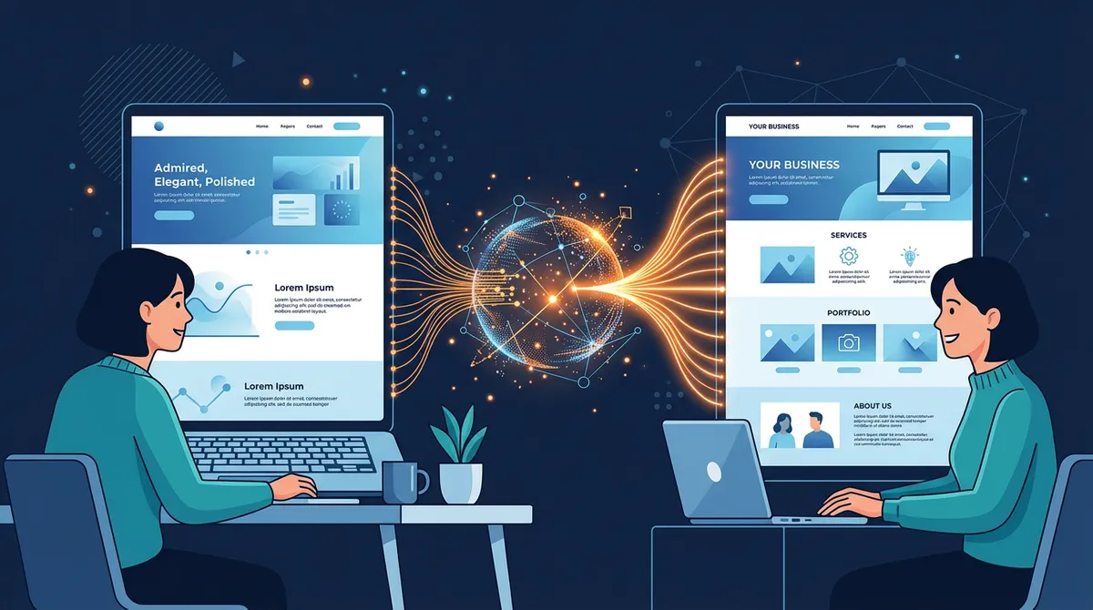
How It Works: From URL to Your Own Custom Design
The process is remarkably simple. In Playcode, you can borrow a website style in four steps:
Step 1: Paste the URL of a site you admire
Find a website that has the look you want. It could be a competitor, a brand you love, or something you stumbled across that just looked right. Copy the URL and paste it into Playcode's AI chat. Tell the AI something like: "I love the style of this website. Use it as inspiration for mine."
Step 2: AI analyzes the visual style
The AI does not just look at the site - it studies it. It breaks down the color palette, identifies the typography (serif vs. sans-serif, bold vs. light, sizes and spacing), maps the layout structure (hero section, grid layouts, card patterns), and captures the overall design language. It understands whether the site feels minimal or dense, warm or cool, playful or corporate.
Step 3: AI builds YOUR site with YOUR content in that style
This is the important part. The AI does not create a copy of the reference site. It creates an original design for your business that carries the same visual DNA. Your business name, your services, your contact information, your story - all wrapped in a design language that you already know you love.
Step 4: Refine until it is perfect
The first result will be close, but you can keep refining. "Make the colors a bit warmer." "Use more whitespace." "Make the headlines bolder." Each iteration brings you closer to exactly what you envisioned. And because you started from a strong visual direction (instead of a blank canvas), the whole process is faster and more focused.
You can also be selective about what you borrow. Maybe you love a site's color palette but not its layout. Or you like the typography but want a completely different structure. Just tell the AI: "Use the colors from this site, but arrange the layout differently - I want a single-column design with large images."
Where to Find the Best Website Design Inspiration
Not all reference sites are created equal. The best ones give the AI clear, strong design signals to work with. Here are the four best places to find inspiration:
1. Competitors in your industry
This is the most practical source, and the one most people think of first. Your competitors have already spent time (and money) figuring out what works for your audience. If the best dental practice in your city has a clean, trustworthy-looking website - that design language works because dental patients respond to it. There is no reason to reinvent the wheel.
Search for the top businesses in your field. Look at who ranks on the first page of Google. Check who has the most reviews. Those businesses have usually invested in professional design, which means their sites are worth studying.
2. Brands you admire
You do not have to stay within your industry. Some of the best design inspiration comes from brands that have nothing to do with your business but whose aesthetic you love:
- Apple - clean, minimal, confident. Massive whitespace, simple fonts, product-focused.
- Stripe - modern, technical but approachable. Gradient colors, clear hierarchy, developer-friendly yet beautiful.
- Airbnb - warm, welcoming, community-oriented. Card-based layouts, friendly typography, lots of photography.
- Notion - simple, functional, understated. Clean lines, subtle colors, content-first design.
- Aesop - premium, earthy, sophisticated. Dark tones, serif fonts, editorial feel.
A yoga studio borrowing Aesop's earthy sophistication. A tech startup borrowing Stripe's modern clarity. A real estate agent borrowing Airbnb's warm, photography-rich style. These cross-industry combinations often produce the most distinctive results.
3. Industry leaders and "best of" lists
Search for "best [your industry] websites" and you will find curated lists of the top-performing sites in your field. These roundups are goldmines because someone has already done the work of identifying which sites look great and convert well.
Try searches like "best salon websites 2026," "best restaurant website design," or "best law firm websites." Save two or three that resonate with you - you can share multiple references with the AI to give it a clearer picture of your taste.
4. Design award sites
Sites like Awwwards, CSS Design Awards, and SiteInspire showcase the most visually impressive websites on the internet. These tend to be more experimental and creative than typical business sites, so they are great for when you want something that really stands out. Be aware that some award-winning designs prioritize visual impact over usability - so when using these as references, you might want to tell the AI: "I like the visual style of this site, but keep my layout simple and easy to navigate."
Real Examples: Style Borrowing in Action
To make this concrete, here are three scenarios showing how different business owners used website design inspiration to create something perfect for their brand.
The yoga studio that wanted calm and minimal
Maya runs a yoga studio in Portland. She found a competitor's website that perfectly captured the feeling she wanted - calming, spacious, with a sense of stillness you could almost feel through the screen. The site used earthy tones (sage green, warm beige, soft terracotta), lots of whitespace, elegant serif fonts for headings, and full-width nature photography.
She pasted the URL into Playcode and said: "I love the calm, earthy feel of this site. Use this style for my yoga studio - Sunrise Yoga in Portland. I want the same feeling of space and stillness, but with my own class schedule, pricing, and instructor bios."
The AI captured those elements - the muted earth tones, the generous spacing, the serif typography - and built a completely original site for Sunrise Yoga. Same feeling, completely different business. Maya then refined a few things: "Make the green a bit more muted" and "Add more space between sections." Three rounds of conversation and she had a site that looked like it cost $5,000.
The electrician who wanted bold and modern
Jake is an electrician in Denver. Most electrician websites look the same - yellow and black, clip art of lightning bolts, stock photos of guys in hard hats. Jake wanted something different. He admired a tech company's website - dark background, bold sans-serif fonts, clean grid layout, and an accent color that popped.
He told the AI: "I want my electrician website to look like this tech company's site. Dark theme, bold fonts, modern layout. But obviously for an electrician - my business is Spark Electric in Denver, and my customers are homeowners. Phone number is 555-0456."
The result was striking. A dark charcoal background with electric blue accents. Bold, modern typography. Services displayed in a clean grid. It looked nothing like a typical electrician website - and that was exactly the point. Jake's site immediately stood out from every competitor in his area. He told the AI to add one more thing: "Add a bright blue 'Call Now' button that is always visible at the top of the page." Done.
The bakery that wanted warm and editorial
Priya owns a bakery in Austin. She saw a trendy restaurant's website that made her stop scrolling - large food photography, warm lighting, a layout that felt more like a magazine spread than a typical restaurant site. Cream backgrounds, subtle gold accents, and a mix of serif and sans-serif fonts that felt both modern and timeless.
She shared the URL with Playcode: "I want my bakery website to have this same warm, editorial feel. Beautiful photography layout, cream and gold colors, magazine-style design. My bakery is called Golden Crust, we specialize in artisan sourdough and French pastries."
The AI built a site that showcased Priya's products like works of art. Large image sections with warm overlays. An "Our Breads" page that felt like flipping through a food magazine. Priya's only adjustment: "Move the order button higher on the page - I want people to be able to place an order without scrolling." One change, and she was done.
Tips for Getting the Best Results
After watching hundreds of people use this feature, here are the techniques that consistently produce the best outcomes.
Share multiple reference sites
One reference is good. Two or three is better. When you share multiple sites, the AI can triangulate your taste more accurately. It starts to see patterns - "they like clean layouts, warm colors, and serif fonts" - and the result captures your preferences more precisely than any single reference could.
"Here are three sites I like: [URL 1], [URL 2], [URL 3]. I like the colors of the first one, the layout of the second one, and the typography of the third one. Build my site combining these elements."
Be specific about what you like (and what you do not)
Do not just share a URL and say "make mine like this." Tell the AI exactly which elements you are drawn to. This is the difference between a good result and a great one.
"I love the color palette and the way they use whitespace, but I do not like their grid layout. I want a single-column design instead. And use a different font - something more modern and clean."
For more techniques on communicating with AI effectively, read our guide on giving AI better instructions for your website.
Provide your real business content
The AI does its best work when it has real material to design around. Do not just give it a style reference - give it your actual business name, your real phone number, your actual services and descriptions. The design will be shaped by the content, and real content produces dramatically better results than placeholder text.
"Use the style of [URL] for my business: Thompson Legal, a family law firm in Chicago. Our main services are divorce mediation, custody agreements, and estate planning. Phone: 555-0321. We are known for compassionate, judgment-free legal support."
Use checkpoints before trying different directions
Before you experiment with a completely different style reference, save your current version. In Playcode, you can save checkpoints that let you return to any previous state of your site. This means you can try three different style directions and compare them without losing anything.
Think of it like trying on clothes. You try on the first outfit, take a photo (save a checkpoint), then try the next one. At the end, you compare them all and pick the winner.
What If the Result Is Not Quite Right?
The first attempt will not always be perfect - and that is completely fine. The beauty of AI is that iteration is fast. Here are three strategies for dialing in the design:
Mix and match from different sources
If the overall result is close but not quite right, try combining elements from different references:
"I like the layout you built, but the colors feel too cold. Can you swap in the warmer color palette from [different URL]? Keep everything else the same."
"The homepage looks great. But for the About page, I want a more editorial feel - like [magazine-style URL]. Long-form text with pull quotes and large images."
Iterate with descriptive language
Sometimes you do not need another reference URL. You just need to describe the adjustment in plain language:
"Make it feel more minimal - remove the background patterns and reduce the number of colors to just two: navy and white."
"This feels too corporate. Warm it up - use rounded corners, a friendlier font, and add some soft color accents."
"Add more personality. The current design is clean but feels generic. Make the headlines bolder, add an accent color (maybe coral or burnt orange), and give it some visual energy."
Undo and try a completely different direction
If the result is not working at all, do not try to fix it incrementally. Go back to the beginning and try a different reference site. Sometimes the style you thought you wanted does not actually work for your type of business, and that is okay. You will know quickly.
For a deeper look at recovering from results you do not love, check out our guide on how to fix AI website mistakes without starting over.
Advanced Techniques for Power Users
Once you are comfortable with the basics, here are some techniques that take your results to the next level.
Reference different styles for different pages
Your homepage, about page, and services page do not all need to follow the same reference. Many professional websites use slightly different layouts for different page types while keeping consistent colors and typography.
"For the homepage, use the bold hero style from [URL 1]. For the services page, use the clean grid layout from [URL 2]. For the about page, use the editorial storytelling style from [URL 3]. Keep the same colors and fonts across all pages."
Describe the feeling, not just the look
Some of the best instructions go beyond visual elements and describe the emotional impact you want:
"When someone lands on my site, I want them to feel like they walked into a high-end spa. Calm. Quiet. Luxurious but not flashy. Everything should whisper, not shout."
"This site should feel like opening a brand-new MacBook. Clean, precise, premium. Every element should feel intentional and every pixel should earn its place."
The AI understands emotional language and translates it into design decisions - spacing, color intensity, font weight, image treatment. Often, describing the feeling produces better results than listing specific visual elements.
Use competitor analysis strategically
Look at your top three competitors' websites and identify what they all have in common. Then tell the AI to do it better:
"I looked at the three top-ranked dental practices in my city. They all use blue and white, have smiling patient photos, and list services in a grid. I want my site to follow the same general pattern - because it clearly works - but make it feel more modern and premium than any of them. Use a deeper blue, better typography, and more whitespace."
This approach is powerful because you are building on proven patterns while differentiating yourself. You are not ignoring what works - you are doing it better.
The Ethics of Design Inspiration: A Clear Line
To be completely transparent about where the line is:
Perfectly fine (and normal):
- Using a site's color scheme as inspiration for your own palette
- Borrowing a layout pattern (hero image, three-column services, testimonial slider)
- Matching a site's typographic style (clean sans-serif, editorial serif, bold and modern)
- Capturing the overall mood and feel of a site you admire
- Studying how a competitor structures their content and doing something similar
Not okay:
- Copying someone's actual text word-for-word
- Downloading and using someone else's photos or illustrations
- Replicating a unique, hand-drawn logo or custom artwork
- Taking someone's proprietary code
- Pretending to be another business
When you use AI to borrow a website's style, none of the "not okay" things happen. The AI creates original code, generates original layouts, and uses your content. It takes the design direction, not the design itself. This is the same thing every design agency in the world does when a client brings in reference images.
Why AI Makes This Accessible to Everyone
Before AI, borrowing a design style required two things most small business owners did not have: a professional designer and a big budget.
You would need to find a designer (and vet their portfolio). Then explain your vision (hoping they understood). Wait days or weeks for mockups. Request revisions. Wait again. The whole process could take a month and cost anywhere from $2,000 to $20,000.
Or you could use a template. But templates are rigid. You pick from a handful of options and try to make one work for your business. The result usually looks like what it is - a template that a thousand other businesses are also using.
AI changes this equation completely. You share a reference, describe your business, and get a custom design in minutes. Not a template. Not a copy. A genuinely original design that captures the style you wanted. And if it is not perfect, you iterate in real time - no waiting, no extra cost, no back-and-forth emails with a designer who is juggling five other clients.
If you are curious about whether AI can truly produce professional-quality results, our guide on whether AI can build a professional website walks through what is possible today.
Getting Started: Your First Style-Borrowed Website
Ready to try it? Here is the simplest way to start:
- Find one website you love. It does not have to be in your industry. Just find a site where you think "yes, that is the feel I want."
- Open Playcode and paste the URL. Tell the AI: "I love the style of this website. Use it as inspiration for my site."
- Describe your business. Give the AI your business name, what you do, who your customers are, and your contact details.
- Be specific about what you like. "I especially like the colors and the typography" or "I love the layout but want different colors."
- Iterate. Review the first result. Ask for adjustments. Save checkpoints along the way. Within a few rounds, you will have a site that captures exactly the style you wanted.
The whole process takes minutes, not months. And the result is not a compromise or a "good enough" template - it is a custom design built around a visual direction you already know you love.
If you want to redesign your old website using this same approach, you can paste your existing site's URL alongside a new reference site and tell the AI: "Keep my content but redesign it in the style of this reference." Best of both worlds.
Frequently Asked Questions
Is it legal to copy a website design?
You cannot legally copy a website's content, images, or code - those are protected by copyright. However, general design elements like color schemes, layout patterns, typography choices, and spacing are not copyrightable. Using another site as style inspiration - the same way designers use mood boards - is completely legal and is standard practice in the design industry. When AI borrows a style, it creates original code and an original layout using your content. No content is duplicated.
Can AI clone a website design from a URL?
AI can analyze a website URL and extract its visual style - colors, fonts, layout structure, spacing, and overall feel. It then uses those style elements as inspiration to build an original design for your business with your own content. The result is not a clone but a new site that captures the same professional feel. Think of it as giving a designer a reference image - they create something inspired by it, not a copy of it.
How is borrowing a design style different from copying a website?
Copying means duplicating someone's actual content, images, and code. Borrowing a style means taking inspiration from visual elements like color palettes, font pairings, and layout structure - then applying them to your own original content. Every professional designer uses references. The AI does the same thing, just much faster and at a fraction of the cost.
What should I look for when choosing a reference website?
Focus on what specifically appeals to you. Is it the color palette? The way text is laid out? The overall mood? You do not need to love everything about a reference site - you can pick and choose elements. The strongest references are clean, well-designed sites with a clear visual identity. Avoid choosing sites that are overly complex or heavily animated, as the AI captures the visual style best when the design is clear and consistent.
Can I combine styles from multiple websites?
Yes, and this often produces the best results. Tell the AI to use the color palette from one site, the layout structure from another, and the typography from a third. This mix-and-match approach creates something truly unique while drawing on proven design patterns. Professional designers do this constantly - it is called creating a mood board.